


I work as a merchandiser for a national company.
We work for one of the large retailers and several customers who have business with them.
That display of shampoo that you walked by or that gift card section, we probably had something to do with it. That Spider-Man display for the new movie (which is fantastic, by the way) or that laptop you were thinking about buying and demoing in the store? Yeah. That's us too.

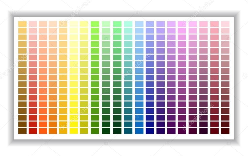
Today I was working on a paint display. The free samples of chips you pick up and decide what colors you want and which ones work best with the others.
You've got your reds and pink, greens and blues, yellows and oranges, etc.
The earth tones and the blacks and whites. I lean towards earth tones when I'm going for paint. I just always have. I love the contrast if black in white in both paint and photography. I don't “paint”. I mean when painting in the house.
The earth tones get me because they all work together. I'm talking about the beige, tan, sand, dark brown, etc. They blend into each other a lot. They just work well together.
And in the picture above they all end up in the same display. Working together to catch the eye of the customer walking by and maybe they'll buy a can.
Funny how colors aren't an issue when they're just left alone.
(That isn't my finished work by the way; I was missing a lot of samples. 😉)
Maybe nothing, probably something.
I'm not that deep of a thinker. Just had to get this out if my head.
That's it. That's the post.
𝚂𝚎𝚎𝚐𝚊𝚛𝚜